DESIGNER COLLECTION ANALYSIS FALL/WINTER 2017/18 MILAN
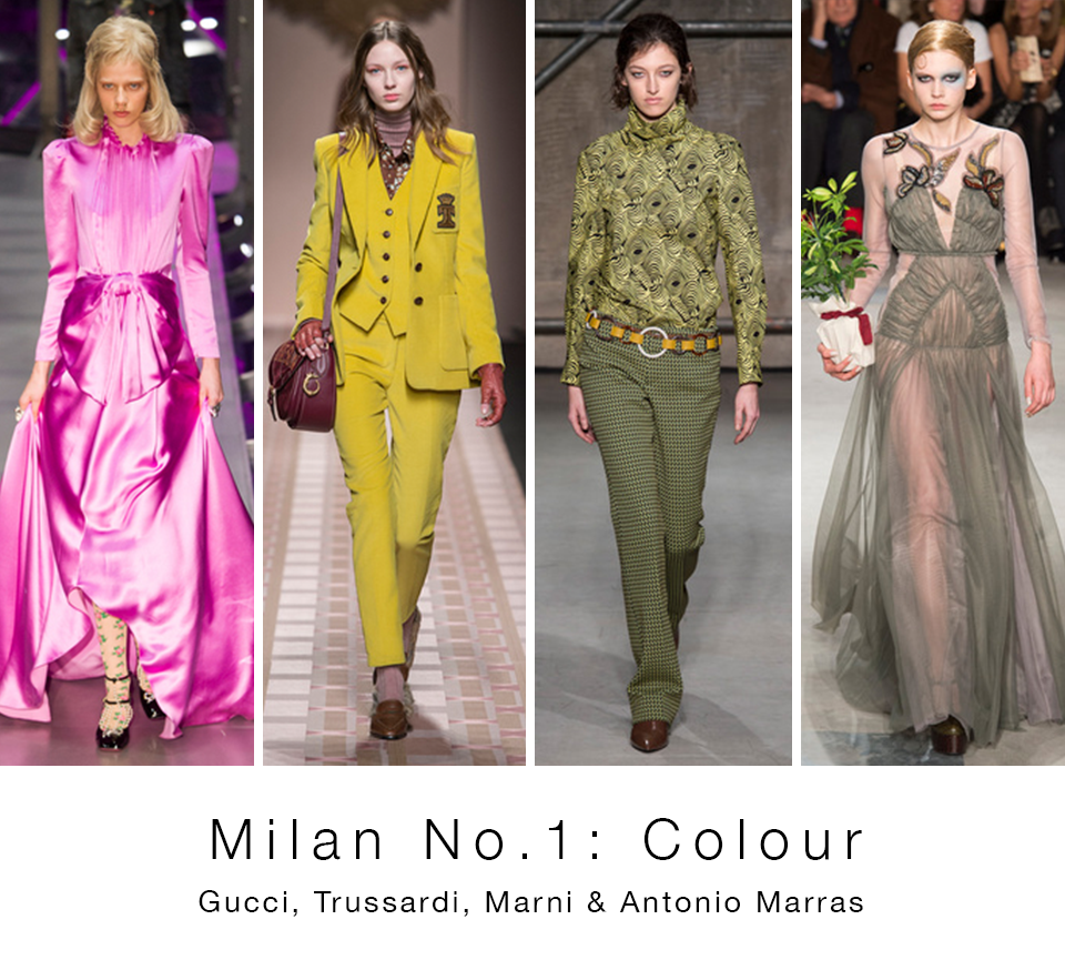
/No. 1 Colour Flashes in Milan
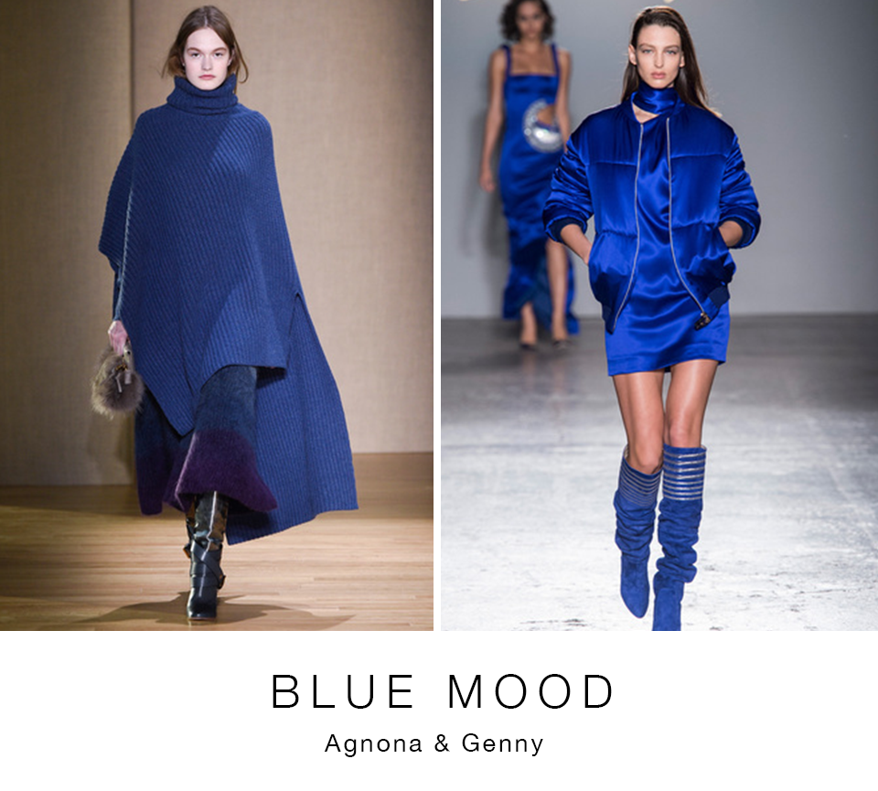
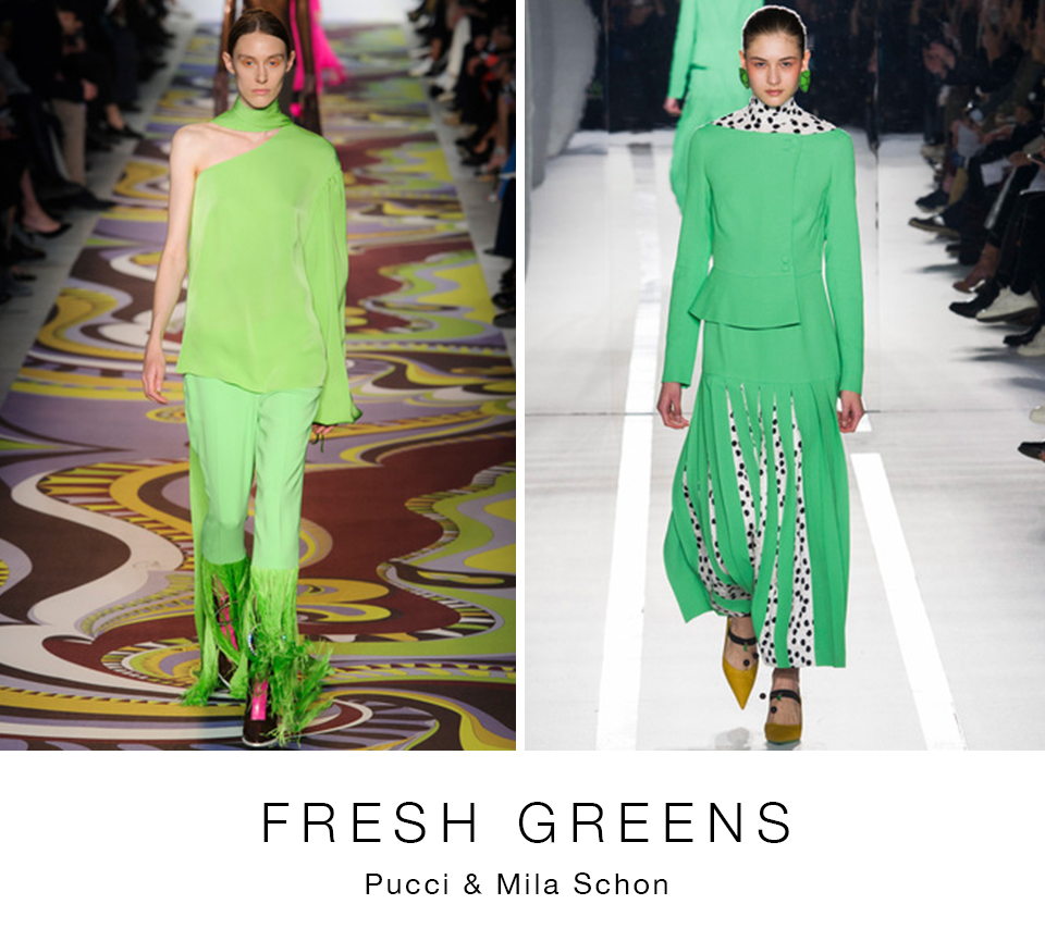
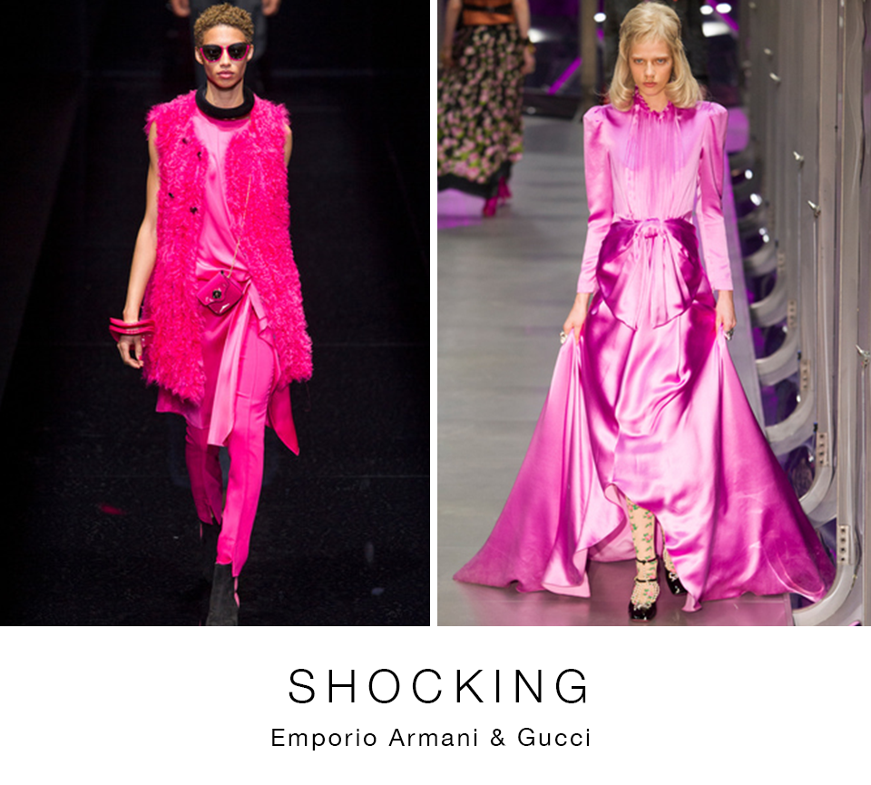
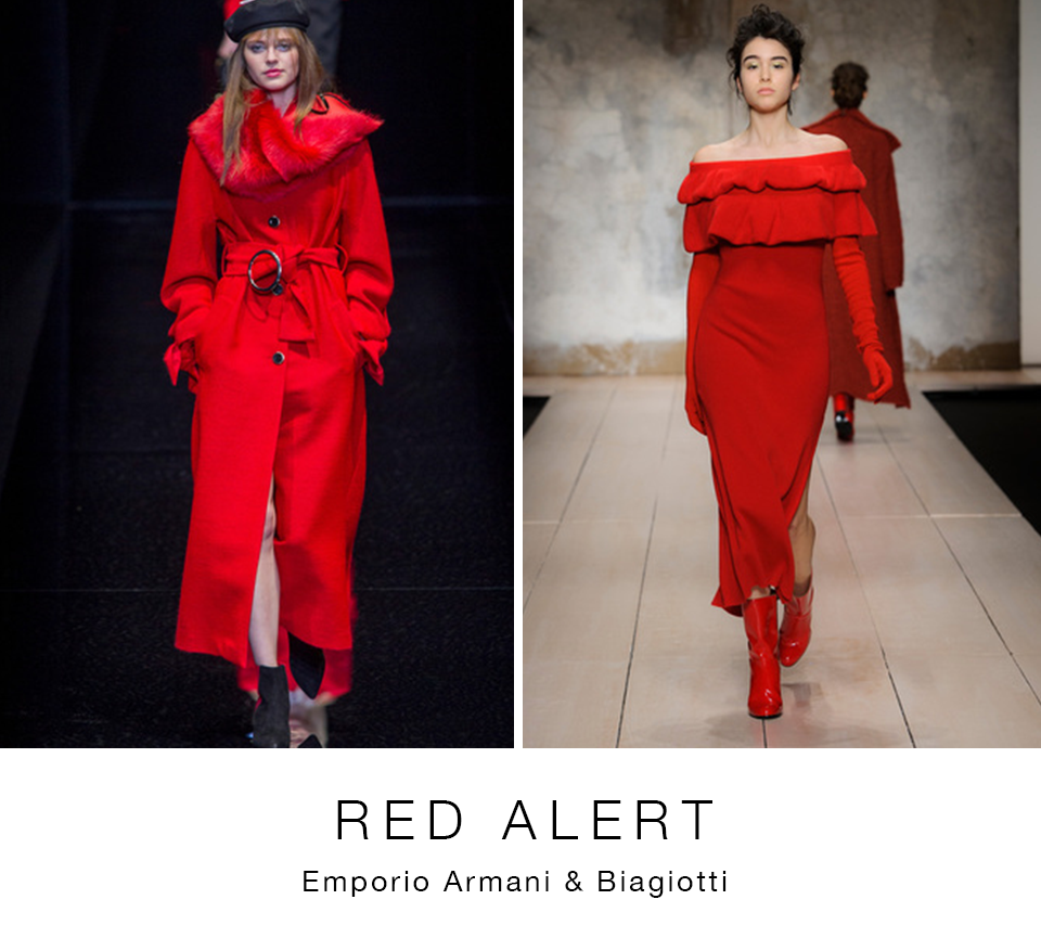
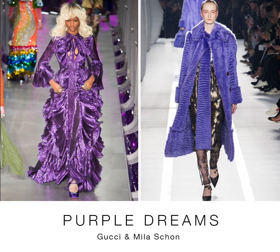
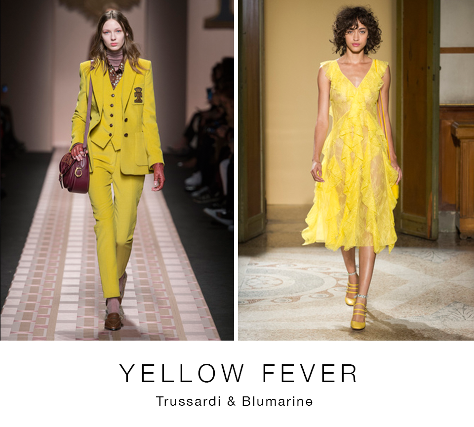
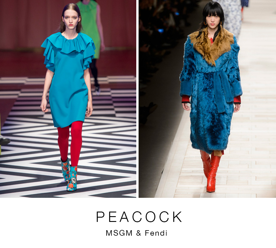
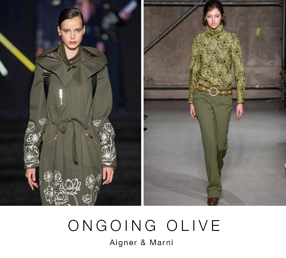
Shots of colour flashed on Milan’s runways making the point that there will be room for optimism next fall. Blues ranged from deep midnight to brighter, royal tints. Reds were represented in most collections, often from head to toe. Whereas the yellow-cast olive green family continued strongly, new, lighter shades of spring-like greens emerged. Yellow, usually associated with spring segued into fall in interesting ways. Another spring/summer favourite, pink, made impact often in almost fluorescent versions. More traditional fall shades, purple and peacock teal, lightened up.
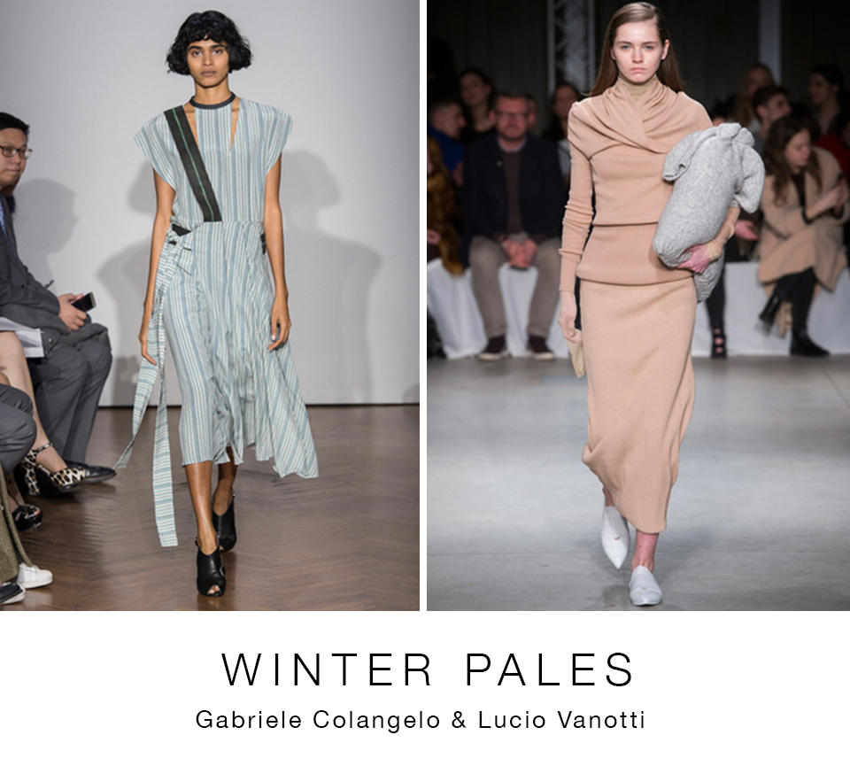
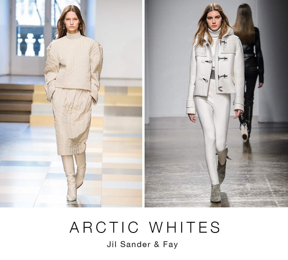
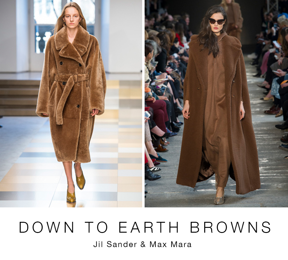
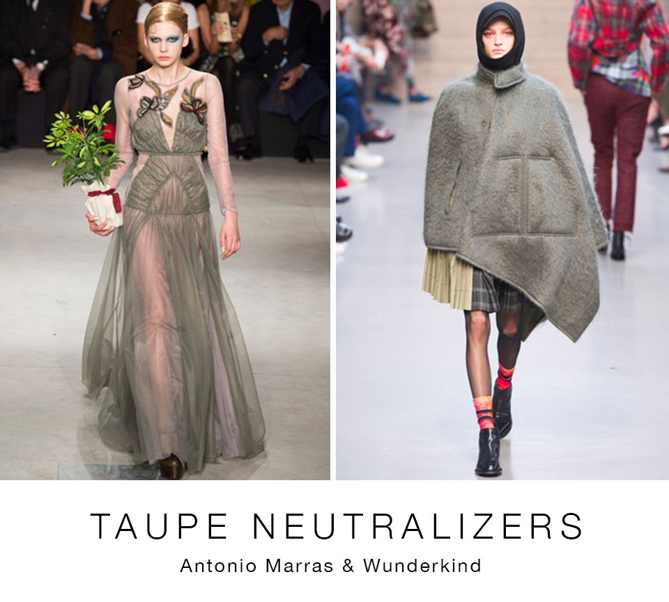
Despite the visual impact of these fall brights, there was a core base of neutral colour represented. Winter whites ranged from cool, icy tones to warmer vanilla shades. Tinted pales added to a sophisticated, glamorous winter pale fashion mood. Grey maintained its presence, however, taupe shades looked newer. And it would not be Italy if there were not a strong contingent of brown shades.
All images IMAXtree
Click arrows for slide show.