DESIGNER COLLECTION ANALYSIS FALL/WINTER 2017/18: NEW YORK
/No 1: Colour Usage Shifts on New York Runways


Images/Imaxtree
Will fall 2017/18 be a colourful season, or will fashions be dark and somber? We will attempt to answer that question.
Naturally, there was the obligatory amount of core black (at least 10%) in most collections shown during New York Fashion Week. But we took the time of actually tallying colour usage and came up with some surprising conclusions.
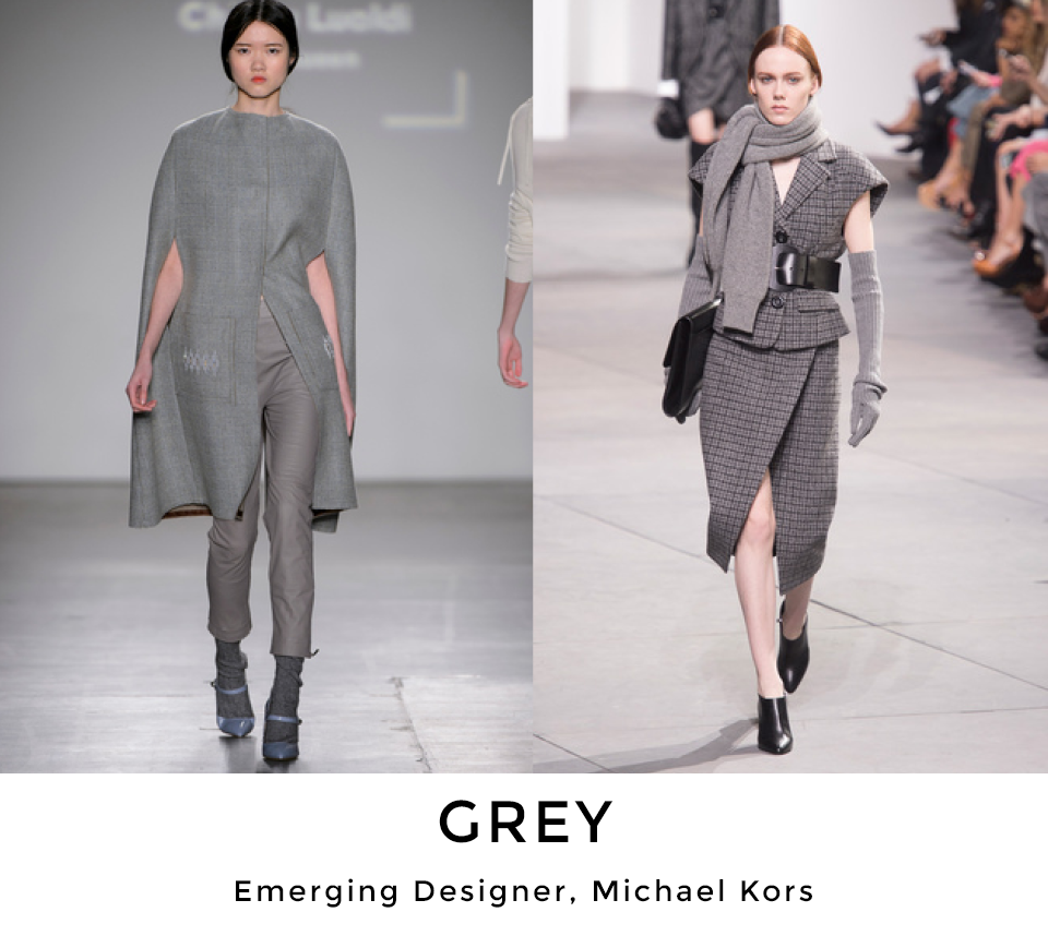
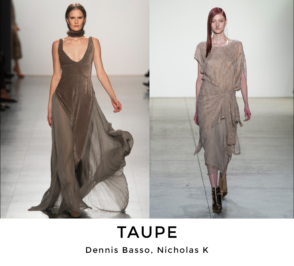
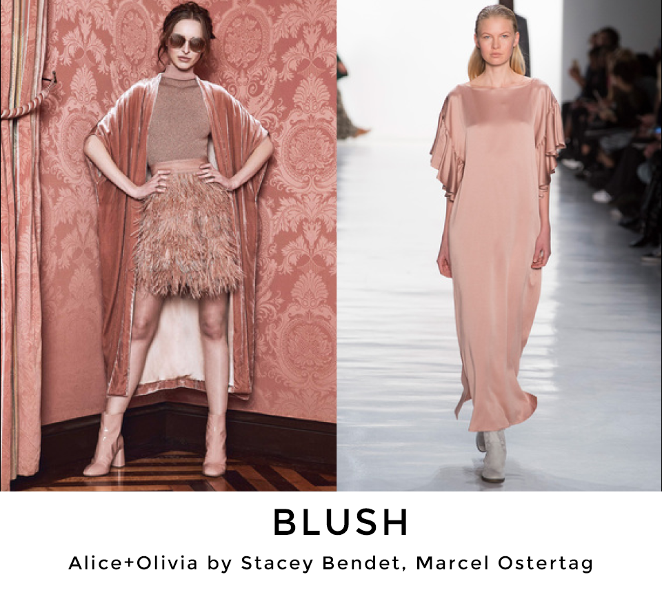
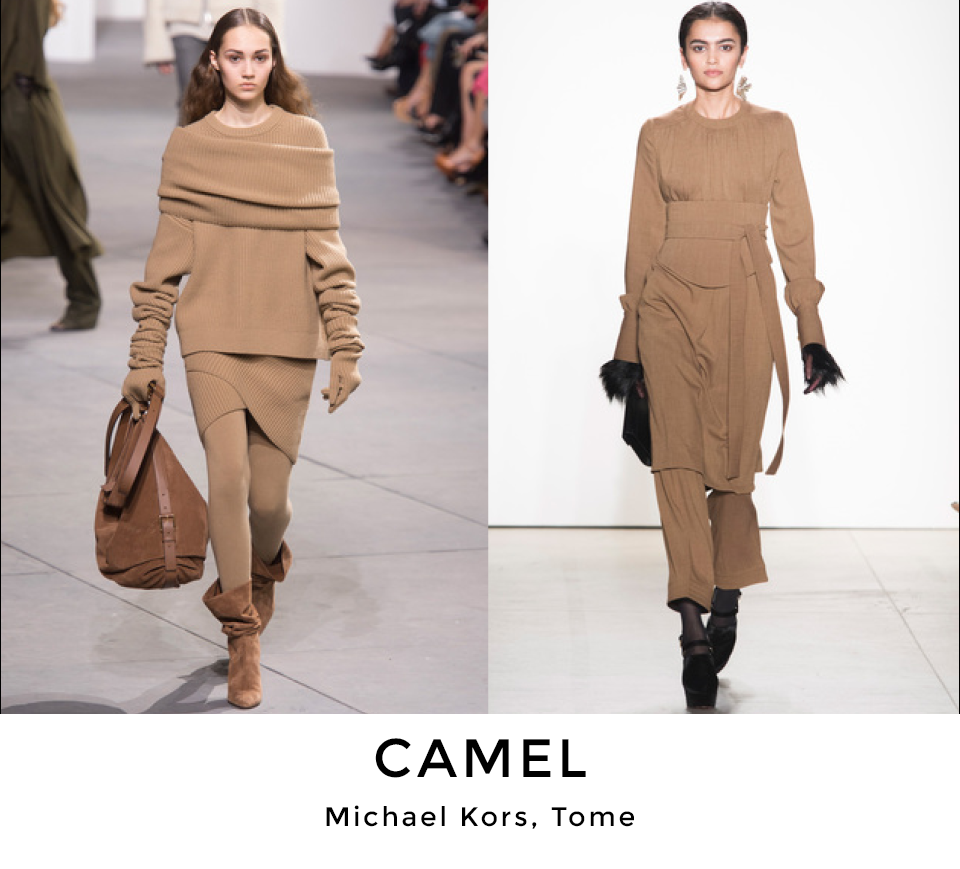
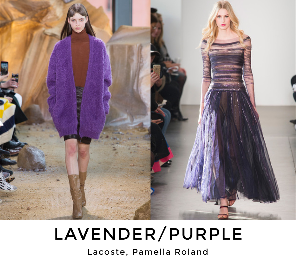
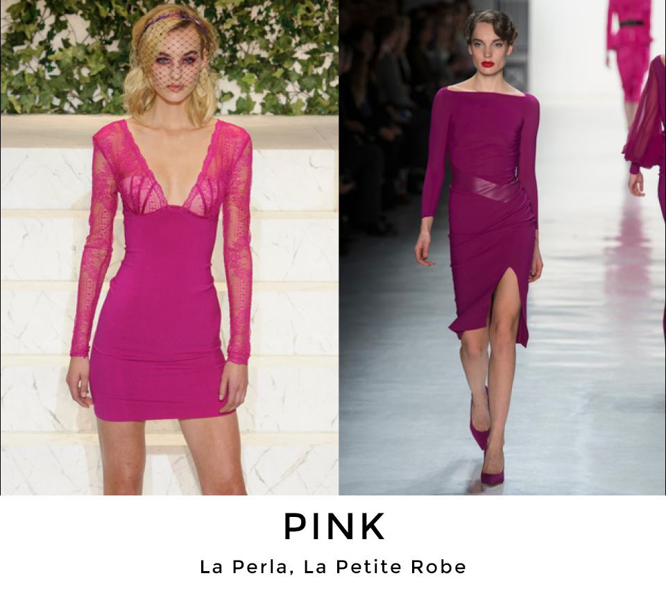
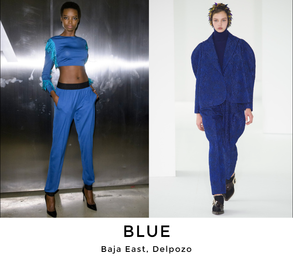
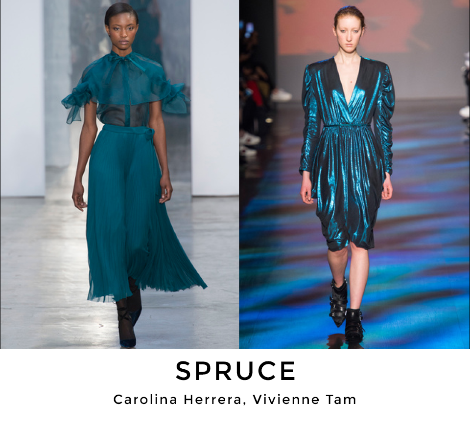
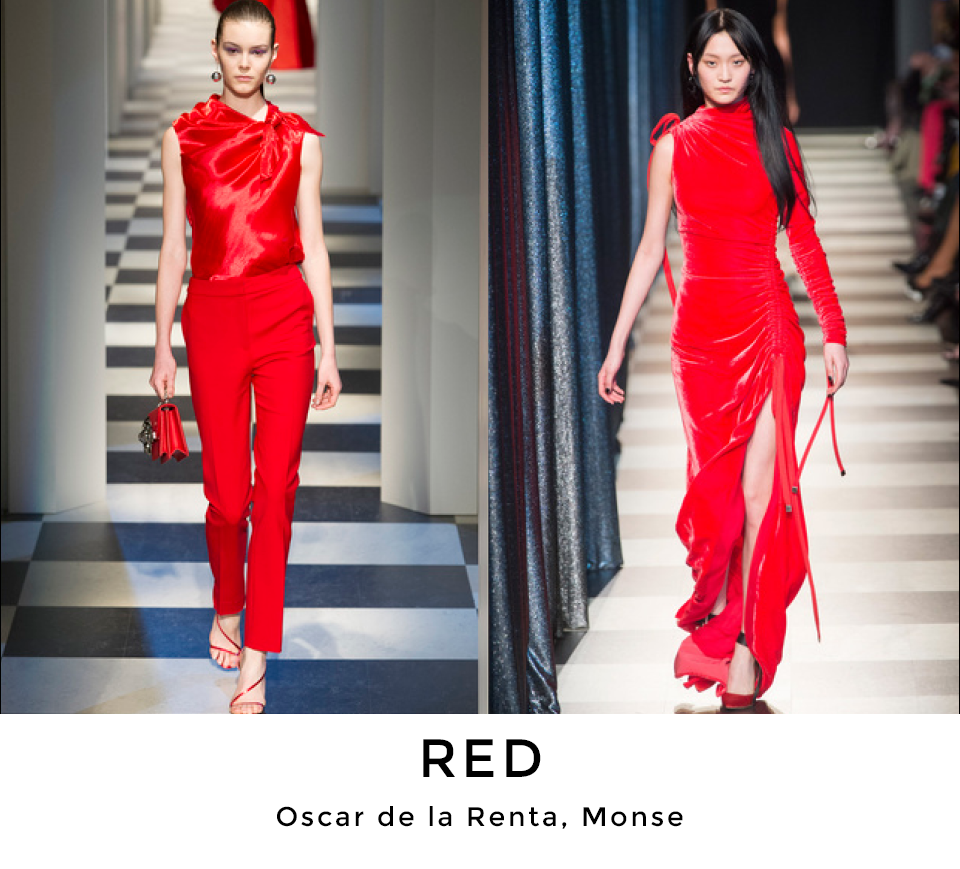
Grey tints, from dark to pale mist, cool and warm taupes, camel plus a very neutral blush shade were strong colour foundations designers built their collections around representing at least 40% of total offerings. The neutral theme continued with subtle lavender and mauve only to be elevated into stronger shades of purple and pink. The blue colour range also went from light to dark, from very pale sky blues, to denim neutrals and dark midnight shades. Next in line were fresh fabric interpretations in spruce/mallard/teal/peacock. Any shade of wine maintained a strong core position topped off by bright red.
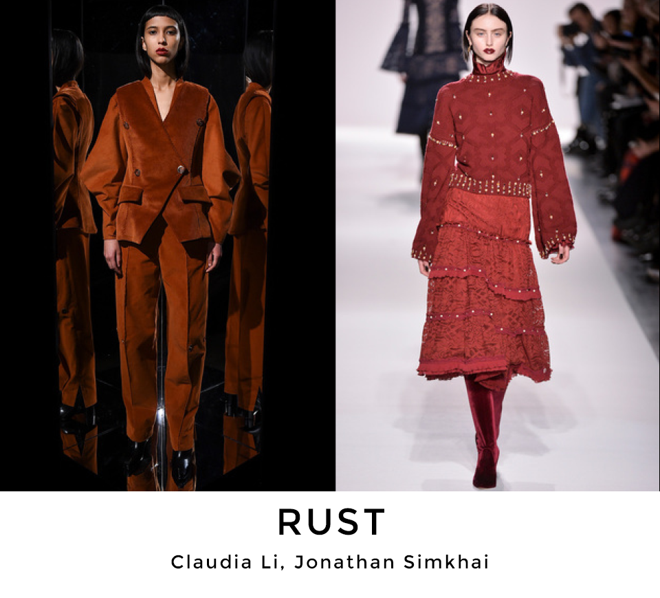
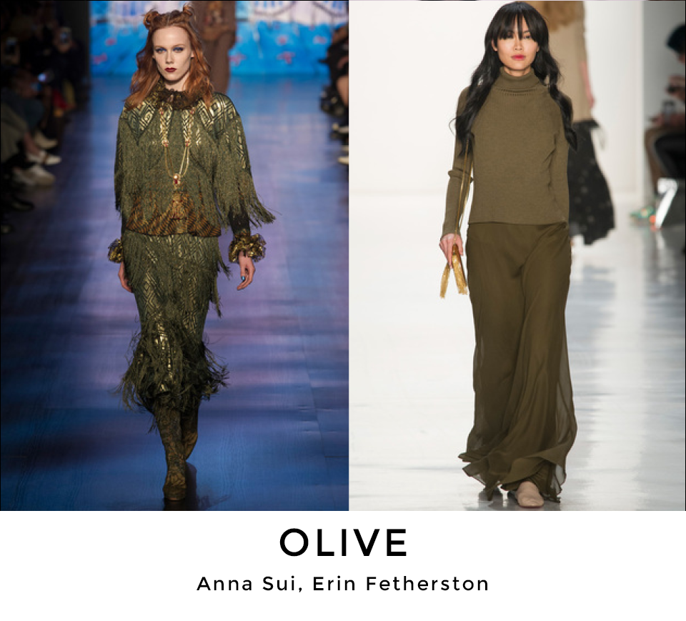
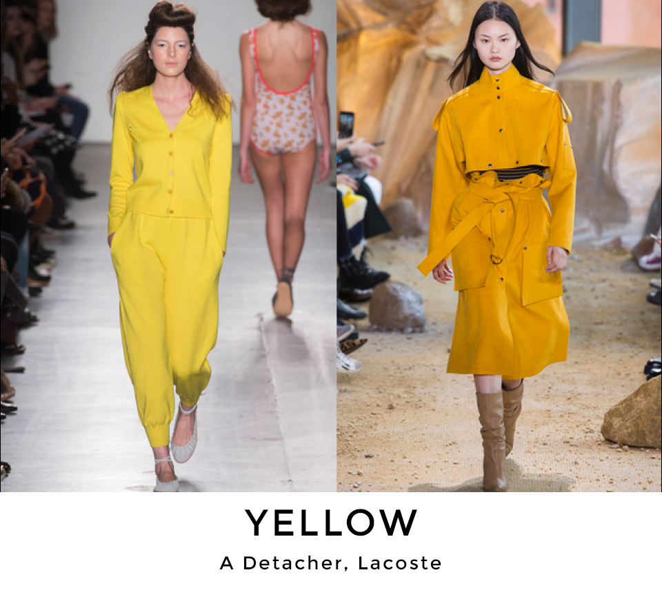
Shades of olive/moss/military green not only continued from the spring season but got noticeably stronger. The rust/orange colour family made a nice complementary secondary statement. But the biggest surprise was the continued powerful presence of anything yellow, from lemon to marigold.
In sum, despite a strong neutral colour foundation, fall/winter 2017/18 will have some exciting, attention-grabbing highlights surely to entice the consumer.